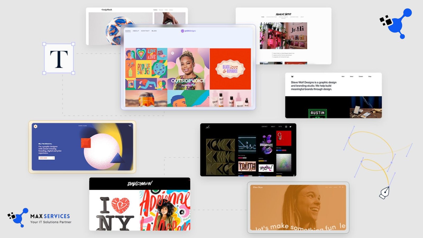
In the digital age, the internet has transformed how people communicate, work, and interact. One of the most noticeable aspects of this transformation is the evolution of Websites and Graphics. Websites and graphics are no longer static or simplistic; they have become dynamic, interactive, and visually stunning. From the early days the way we design and interact with websites has changed dramatically in digital marketing.
The Early Days of the Web
The first websites, created in the early 1990s, were basic, text-heavy pages with minimal graphics. The primary focus was functionality rather than aesthetics. Websites were designed to be informational and were often built using simple HTML.HTML a language that defined the structure of a webpage. Early websites had a limited color palette, often with backgrounds. Either white or off-white, and simple fonts that lacked the flair of modern web typography.
Graphics in these early days were also rudimentary. The internet’s bandwidth was slow, and the technology available for displaying graphics was limited. Images were typically small and compressed to ensure faster loading times. Animations, if present, were usually crude GIFs, and the overall aesthetic was far from polished. Despite these limitations, early websites were groundbreaking in their ability to share information globally.
The Rise of Web Design
By the late 1990s and early 2000s, web design began to evolve rapidly. The advent of more sophisticated web technologies such as CSS (Cascading Style Sheets) and JavaScript allowed for greater control over layout, design, and interactivity. Designers could now create websites with more intricate structures and complex visual elements, making the web experience more engaging. During this period, Flash became one of the dominant technologies for creating rich, interactive web content. Flash allowed designers to integrate multimedia elements like animations, video, and sound into websites. This opened up new possibilities for creativity. Led to the creation of highly interactive websites that could capture users’ attention with dynamic visuals.
However, Flash also had its limitations. It was not supported on all devices, especially mobile phones, and it could slow down website performance. As mobile browsing became more prevalent, Flash’s shortcomings became apparent, and developers began to seek alternative solutions.
The Mobile Revolution and Responsive Design
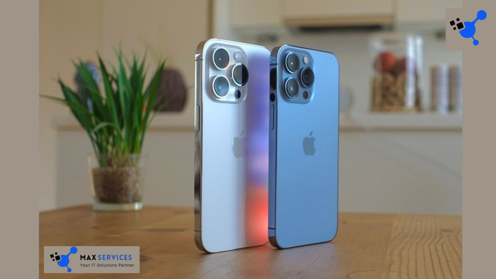
With the introduction of the iPhone in 2007, mobile internet usage skyrocketed. Suddenly, websites needed to be optimized for smaller screens and touch interfaces. This shift required a new approach to web design: responsive design. Responsive web design (RWD) is an approach that allows websites to adapt to different screen sizes, ensuring a seamless user experience across a variety of devices. The key principle of responsive design is fluidity. Elements such as images, text, and navigation adjust in size and position based on the device’s screen size. This was a game-changer for Websites and Graphics, as it allowed websites to function smoothly on smartphones, tablets, and desktop computers without needing separate versions for each device.
Responsive design relies on a combination of flexible grid layouts, CSS media queries, and fluid images. This approach ensures that the website’s design remains consistent, regardless of the device used to view it. The widespread adoption of responsive design has become one of the defining characteristics of modern web development.
The Rise of Flat Design and Minimalism
As web design evolved, the trend shifted toward a more minimalist and clean aesthetic. Flat design, a design trend that focuses on simplicity and usability, gained popularity in the 2010s. Flat design eliminates the use of complex textures, gradients, and three-dimensional effects in favor of clean lines, bold colors, and simple typography. This design philosophy is often paired with an emphasis on functionality and ease of navigation. One of the main drivers of flat design was the rise of mobile devices. Mobile interfaces benefit from simple, uncluttered designs that are easy to navigate on smaller screens. Flat design makes it easier to create user-friendly interfaces, which is essential for providing a positive mobile experience. The trend toward flat design also aligned with the increasing importance of user experience (UX) design, which focuses on creating intuitive, accessible websites and applications.
While flat design is still prevalent today, it has evolved to incorporate elements like subtle gradients, shadows, and depth to add dimension without compromising simplicity. This evolution is sometimes referred to as “flat 2.0,” which balances the minimalist aesthetic of flat design with a touch of visual depth to enhance the overall user experience.
The Role of Typography in Web Design
Typography has always been a key element of web design, but in recent years, it has taken on an even greater role. The availability of web fonts through services like Google Fonts and Adobe Fonts has revolutionized how designers approach typography. In the past, designers were limited to a small selection of system fonts that were widely available across different devices. Today, however, designers have access to a vast array of fonts, allowing for more creative freedom and greater control over the visual identity of a website.
The trend toward custom typography has also led to a rise in the use of variable fonts, which allow designers to adjust the weight, width, and style of a font dynamically. This flexibility enables more expressive typography and better performance, as variable fonts require fewer resources to load than multiple individual font files. Bold, unique typography can help establish a brand’s identity and create a memorable user experience. As websites become more visually rich, typography plays a central role in guiding users through the content and enhancing the overall aesthetic appeal.
Interactive and Immersive Websites and Graphics
One of the most exciting developments in digital graphics is the rise of interactive and immersive experiences. The integration of interactive elements into websites has become a hallmark of modern design. From parallax scrolling to interactive animations, designers now have a wide range of tools at their disposal to create engaging, dynamic websites. Parallax scrolling is a technique in which the background content moves at a different speed than the foreground content, creating a sense of depth and immersion. This effect has become popular in modern web design, particularly for storytelling websites and landing pages. Parallax scrolling helps create a more engaging experience by encouraging users to explore the website and interact with the content.
In addition to parallax effects, modern web design often incorporates interactive animations that respond to user actions. For example, hover effects, scrolling animations, and click-based interactions can add a layer of engagement and surprise to a website. These interactive graphics not only enhance the user experience but also encourage users to spend more time on the site, increasing engagement and reducing bounce rates. Another trend in immersive web design is the use of 3D graphics. These graphics can range from simple 3D models to complex, fully interactive virtual environments. The use of 3D graphics is particularly popular in industries like e-commerce, gaming, and architecture, where realistic product displays and immersive environments can enhance the user experience.
The Impact of Artificial Intelligence and Machine Learning
As artificial intelligence (AI) and machine learning (ML) technologies have advanced, they have begun to influence the world of web design and digital graphics. AI tools are being used to automate design processes, improve user experience, and generate personalized content.
For example, AI-powered design tools like Wix’s ADI (Artificial Design Intelligence) allow users to create websites by simply answering a few questions. The AI then analyzes the user’s preferences and automatically generates a website that suits their needs. This makes web design more accessible to individuals and businesses without design expertise. Machine learning algorithms are also being used to improve the performance of Websites and Graphics. AI can analyze user behavior to optimize layouts, suggest content, and even personalize the visual design of a website based on individual preferences. This level of personalization creates a more engaging experience and helps businesses tailor their websites to the specific needs of their audience.
Additionally, AI is being used in the creation of digital graphics. Tools like DALL·E and other generative AI models can create images based on text descriptions, opening up new possibilities for designers and artists. AI-generated graphics are being used in various industries, from marketing to entertainment, allowing for faster and more cost-effective production of visual content.
The Future of Websites and Graphics
The future of web design and digital graphics is exciting, with new technologies and trends constantly reshaping the landscape. One area that is likely to have a significant impact is augmented reality (AR) and virtual reality (VR). As these technologies become more accessible, Websites and Graphics will become even more immersive, allowing users to interact with content in entirely new ways. For example, e-commerce websites could allow customers to “try on” clothes or visualize products in their homes using AR, while VR could create fully immersive digital experiences for entertainment and education.
Another trend that is expected to continue is the integration of voice and gesture controls into web design. As voice assistants like Siri, Alexa, and Google Assistant become more sophisticated, websites will need to adapt to allow users to navigate using voice commands. Similarly, gesture-based controls, enabled by technologies like the Microsoft Kinect or Apple’s Face ID, could become a more common way for users to interact with websites and digital content. The use of artificial intelligence will also continue to grow, enabling even more personalized and adaptive user experiences. Websites will become smarter, learning from user behavior and adapting to provide content that is most relevant to each individual. This could lead to websites that feel more intuitive and personalized, providing a unique experience for every user.
Websites and Graphics Conclusion
The rise of responsive design, flat design, custom typography, and interactive graphics has reshaped the way we experience the web. With the advent of new technologies like artificial intelligence, augmented reality, and virtual reality, the future of web design promises even more exciting possibilities. As technology continues to evolve, so too will the world of Websites and Graphics. The future holds endless potential for innovation, creativity, and user-centered design. Making the web a more engaging, immersive, and visually stunning place than ever before.


